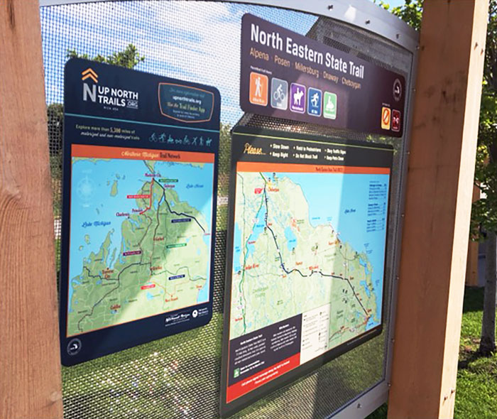
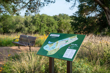
I recently stopped at a park along a river in my hometown. Upon entering from the parking lot, a sign with vibrant graphics and colors shared rules and pertinent info, and another offered a detailed trail map. Shortly I came upon a sign explaining the park’s support of pollinators, featuring colorful insects and birds. Another explained why we shouldn’t feed bread to ducks. Others explained a shoreline restoration project, offered local site history, shared boating safety tips and touted the landscape as environmentally friendly. A warning sign was posted near an unsupervised water feature. And there were signs with pavilion reservation information and rules for the tennis courts, playground and skatepark.
We may not always notice signs in public spaces, but without them we’d be, well, lost. Stephanie Coufal, sales and marketing director for a Temple, Texas-based sign manufacturer, said, “Clients understand that well-designed signage can effectively convey their messages, reflect their brand identity and contribute to the overall ambience of the space.”
She pointed out a noticeable trend toward more artful and eye-catching signage in public spaces. “There’s a growing emphasis on the look and design of signs, including considerations such as graphic elements, typography, color schemes and overall visual impact.”
Wayfinding remains a primary reason for sign placement in parks, trails, recreational facilities and other public spaces,
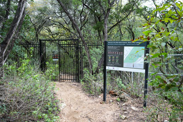
according to Coufal. “(We recognize) the importance of effective wayfinding signage in helping visitors navigate complex environments, local amenities and access-desired destinations with ease and confidence. Clear and intuitive wayfinding signage enhances the overall visitor experience and contributes to the efficient and enjoyable use of public spaces.”
And just as I’d seen the signs offering educational information in my park, Coufal said they’ve observed an increasing trend among parks and municipalities utilizing signage for these purposes. “There is a growing recognition of the role signage plays in providing informative content about local flora, fauna, historical significance and environmental conservation efforts. Parks and public spaces are leveraging signage to engage visitors, enhance their understanding of the surroundings and foster a deeper connection with the natural and cultural heritage of the area.”
Coufal said most customers submit print-ready files for production, while others take advantage of their graphic design, materials selection and fabrication techniques. “We can also recommend professionals in the design/build community who can collaborate with clients to develop custom designs that meet their specific requirements, objectives and aesthetic preferences.”
One company offering wayfinding, planning and signage design is the Traverse City, Mich.-located Corbin Design. “One of our company’s mottos is ‘fewer, better signs,’” said Lead Designer/Design Director Jeff Frank. “We’re not looking to come into a community or space and clutter it with signs, we’re looking to find appropriate, thoughtful locations to install signs and have these signs work hard for us.”
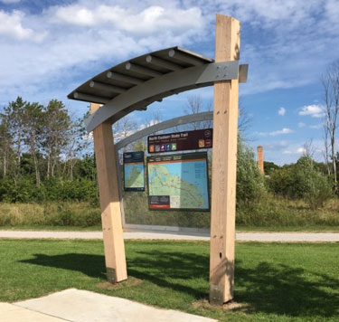
Frank said they consider their signs to be a 360-degree experience. “When we install a pedestrian kiosk, our intention for that sign is to provide overhead directional information to key destinations; a wayfinding map on one side and then on the backside, other content, whether it be a calendar of events or historical/informational (content).”
He said this allows one group of visitors to have different interactions with the same sign. “Someone can be figuring out where the nearest restroom is while their partner is on the backside of the sign learning about the varieties of native plant species in the area.”
Before starting the design process, Frank said it’s important to meet with stakeholders, explore the space and conduct
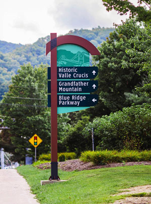
research. “This then informs how we can best reflect the character, history, culture and architecture of an environment through our design. For us, this is important because it grounds the signs in a way that visitors can relate to them; the signs can tell a story.”
In Wheaton, Ill., Cantigny Park is the 500-acre former estate of Col. Robert McCormick, longtime editor and publisher of the Chicago Tribune. The park boasts a visitor center, museums, botanical gardens and three miles of walking trails. Part of a revitalization plan had Frank’s company create a new sign system featuring interpretive graphics and a fresh map design to enhance the park’s aesthetic and promote exploration.
Frank explained that while Cantigny Park is beautiful, it’s also grounded in history. “Our design is an intentional reference to the historic French fingerpost signs with a modern twist.”
The signs include universal symbols for amenities and estimated walking times to reach destinations. “The color palette is meant to blend with the environment yet be apparent enough when visitors are looking for information. The red accent color is a nod to the red poppy flowers that grew in Cantigny, France, and then became a symbol for the fallen soldiers—it appears in the First Division patch as well.
“On the other end of the spectrum,” Frank continued, “something like an urban trail system, we know that the signs will be competing with a much more cluttered streetscape, and the intention is to keep visitors along a specific path rather than throughout a park. In this case the signs will need to have a bolder appearance, whether through shape or color, to stand out in a balanced manner for visitors.”
Frank said there is no one-size-fits-all solution when it comes to wayfinding and signage. “We can create systems that support intuitive environments or we can help simplify a complex environment through signage. Regardless of the type of space, to develop an effective wayfinding and signage system you need to analyze how visitors and users are getting from point A to point B and then anticipate their needs along the way.”
Oftentimes programs seek to develop styles or templates used throughout their systems. “It’s less about individual signs addressing unique scenarios and more about creating a standard family of signs that can address multiple issues/needs. The program is anticipating the needs of the user, not just reacting to a single problem.” Frank said this helps to create consistency and expectation for users, as well as simplifying the maintenance side of signage for the facility.
The strategy of developing a “family of signs” also carries over to interior designs, according to Frank, who said they build an “anticipatory value”: a consistent look, feel and terminology from sign to sign so that “once a visitor uses one sign, they’ll have a general idea of what to expect with the next sign.” He added, “When we can connect the anticipatory value from the exterior to the interior, that’s when we know we’ll have a truly successful program.”
“Many customers prioritize placemaking and branding initiatives to establish a distinct sense of identity and personality across their sites or facilities,” said Coufal. She added that they collaborate with clients to develop solutions that “align with their branding guidelines, reflect the unique character of the environment and contribute to a cohesive and memorable visitor experience.”
Erika Young, public relations and marketing manager for the St. Charles Park District in Illinois, explained that the
marketing and naturalist departments have embarked on a three-year project to replace or add signs in all natural areas, as many have been in use for 15-plus years. She went on to describe some of the ways their sign program is utilized.
“(We use) interpretive signs in our natural areas and parks to educate visitors on the history of the area, the significance of the land, restoration efforts and other important information. Signs help us promote the importance of pollinators, monarch waystations and conservation or restoration efforts. We also use signs to recognize volunteers, such as Eagle Scouts, on park improvement projects. And signs are what make the memorial program of benches, trees and pavers so popular. We also use signs for names of buildings or areas within a park.”
Sometimes residents inspire new signage, and Young said their naturalists were fielding a lot of questions about fishing, so new signs addressing this activity were being added. “Sometimes a sign is part of a grant recognizing some sort of achievement or significant element of a specific park or natural area. Most of these signs are designated with multiple logos, such as Illinois Department of Natural Resources.”
When it comes to wayfinding, “The park district has a ‘walking for wellness’ initiative encouraging people of all ages to use the park trails,” said Young. “As such, we have created walking maps that indicate the mileage loops within 11 large parks.” And drivers are accommodated as well. “The park district provides vehicular wayfinding signs at community parks, where large events and tournaments are likely.”
Young said that seasonal signs can be impactful, and discussed a park site where they began a Carry In, Carry Out program for garbage. “Signs were placed strategically throughout the park asking patrons to keep the park clean by removing any garbage or recyclables. Previously, 23 to 30 cans were needed at this park. Now only 10 to 12 are used onsite.” The program proved so successful that this year they’re expanding it to include two additional parks.
Another popular program involved putting temporary signs up promoting spring ephemerals in a wooded area of a park where many of them grow, as part of a county-wide effort to track the plants using the iNaturalist app, through which park visitors can upload pictures. “Every day can be a new adventure finding them,” said Young, who added that the program is in its fourth year.
“I believe the design of a sign impacts the number of people who will actually read it,” said Young, who explained that
under the direction of herself and the administrative team, the majority of their signs are designed in-house by their marketing department’s graphic designer and sent to the manufacturer. “We do have similar color palettes and fonts we follow, depending on the purpose and longevity of a sign.”
Young said that parks crews evaluate the condition of signs during regular inspections, and mentioned that many of the signs are made of aluminum. “These last anywhere from five to 10 years. We frequently use high-pressure laminate signs that last up to twentyish years, like the ones going into the natural areas. They’re also resistant to vandalism. We’ve learned that wood does not last a lifetime.”
Coufal’s company manufactures custom high-pressure laminate (CHPL) signs, and she said the material is a preferred choice for outdoor signage in high-traffic public spaces. “This is due to CHPL’s durability, resistance to wear and vandalism, ease of maintenance and customization options.” She said these qualities make the panels “an excellent long-term investment for businesses and organizations seeking reliable and visually appealing outdoor signage solutions.”
Customers are increasingly incorporating braille signage and offering signs in multiple languages, according to Coufal, to make their sites more accessible to individuals with diverse needs and backgrounds. “This commitment to inclusivity ensures that all visitors can fully participate and engage with the environment, regardless of language barriers or visual impairments.”
She said they frequently encounter park districts and cities implementing Master Sign Programs that guide the use of signage and wayfinding systems. “These programs establish cohesive design standards, typography, color schemes and placement guidelines to create a unified and consistent visual identity throughout the site or jurisdiction.”
Young said they’ve been evaluating their signs with plans to document and replace or improve signs throughout the community. “I’ve been working on a sign manual for the district to follow for years to come that includes size, designs, mounting, etc.”
Coufal said they continuously monitor trends and innovations in signage and wayfinding technology. “Some emerging trends include the integration of digital displays for dynamic content delivery, the use of augmented reality for interactive experiences, sustainable materials and manufacturing processes and the adoption of universal design principles for inclusive environments.”
“Signs are one of the best marketing tools for the St. Charles Park District,” said Young, as they can be used to remind people of the rules, inform them of their surroundings and educate them on conservation or items of historical significance. “Signs represent the park district’s brand and mission of enriching your life, so placing high-quality, beautifully-designed signs for whatever purpose needed is essential for communicating with park visitors.” RM


